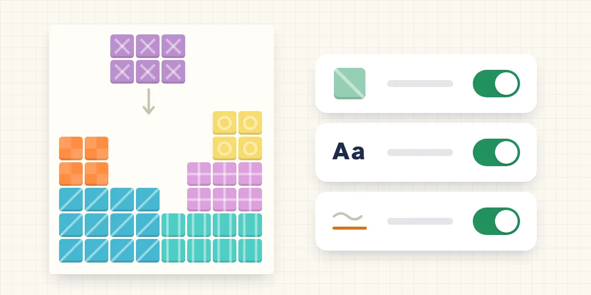
In short: A learning app is more accessible when it never shows information through colour alone, lets you switch off motion and keeps text easy to read. On fonts, the research is sobering: so far, special dyslexia fonts haven’t been shown to improve reading. Droptiply offers colour patterns, high contrast, reduced motion and such a font as an option, without promising an effect.
A made-up scene: a boy playing on a tablet says, “Those two blocks are the same.” To his sister they aren’t. One is mint green, the other sage green. Only weeks later does an eye test show that he finds it hard to tell red and green apart. In the game it didn’t hold him back; with a colour-coded workbook it was more of a problem.
Accessibility sounds like a special case. In a class of 25 children, it isn’t.
How many children see colours differently?
More than you might think. A meta-analysis with data from over 1.7 million children and adolescents in 56 studies estimates the worldwide prevalence of congenital colour vision deficiency at 2.6 per cent: 4.4 per cent in boys and 0.6 per cent in girls. Red-green deficiency is the most common type (Jeong et al., 2025). So in a mixed class there’s often one child for whom some colours look the same.
Often nobody knows. One study points out that without mandatory screening, colour vision deficiency goes unnoticed in most affected children. There, 181 schoolchildren with normal colour vision solved maths tasks that relied on colour, once as normal and once wearing glasses that simulate a strong colour vision deficiency. With the glasses they made more mistakes, were more frustrated and less confident (Dlay & Jordan, 2025).
The rule that follows is simple, and the international guidelines for accessible web content state it too: colour must never be the only means of conveying information (W3C, 2018).
Do dyslexia fonts help?
This deserves an honest look, because the promises are big and the evidence is thin.
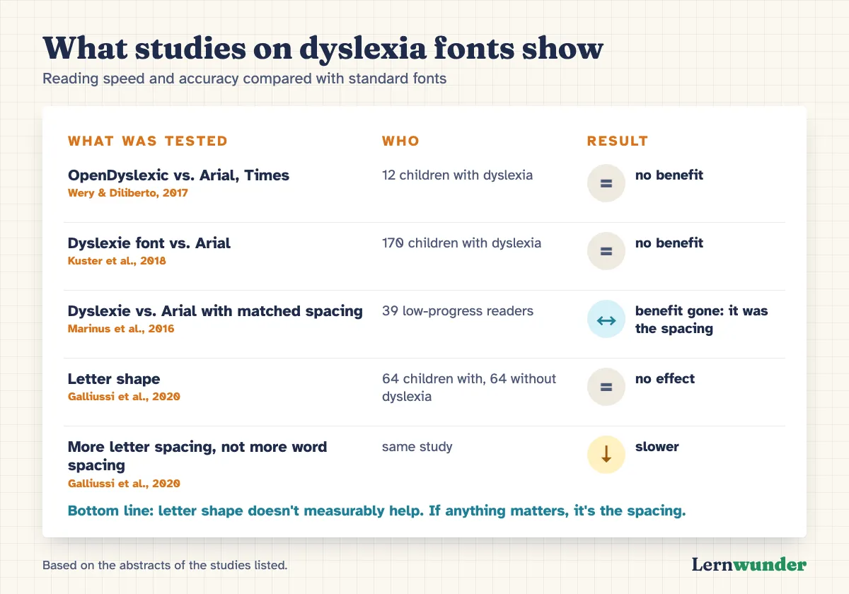
For the OpenDyslexic font there’s a study with twelve primary school children with dyslexia. Compared with Arial and Times New Roman, they read neither faster nor more accurately with it, and none of the children preferred reading in it (Wery & Diliberto, 2017). The study is small. Larger ones exist for a similar font called Dyslexie: 170 children with dyslexia read texts in it no faster and no more accurately than in Arial, and most preferred Arial. A second experiment with word lists found the same (Kuster et al., 2018).
What’s interesting is why some studies do find a small benefit. Among 39 low-progress readers, the Dyslexie font gave about 7 per cent more words read per minute. When Arial was given the same spacing between letters and words, the difference disappeared. It was the spacing, not the letter shapes (Marinus et al., 2016). A study with 64 children with and 64 without dyslexia also found no effect of letter shape. More space between letters without correspondingly more space between words actually slowed reading down (Galliussi et al., 2020).
For maths apps there’s another point: the less reading is needed, the less depends on the font. We explained why learning apps for younger children should work without reading in Maths without reading.
Why motion should be optional
Sparkles, particles, wobbling text: games are full of movement, often with no purpose. For some children it’s more than distracting. In a large US survey, parents reported that 5.3 per cent of children aged 3 to 17 had been bothered by dizziness or balance problems in the past year (Li et al., 2016). That’s a broad definition, but it shows this isn’t just a few children. The W3C guidelines recommend that animations triggered by interaction can be switched off. In their explanatory notes they list dizziness, nausea and headaches as possible reactions in people with vestibular (inner ear) disorders (W3C, 2018).
Even without such symptoms, visual clutter costs attention. In an experiment, kindergarten children in a heavily decorated classroom learned less and were more often distracted than in the same room without decorations (Fisher et al., 2014). That was a classroom, not a screen. Transferring it to apps is our own reasoning, but it’s a reasonable one.
What you can do
- The greyscale test. Briefly switch the tablet to greyscale in the accessibility settings and play a round. Is everything still recognisable? Then nothing depends on colour alone.
- Double up colour codes. If you sort things by colour in class, add symbols, patterns or letters: green circle and triangle, red circle and square.
- Ask rather than guess. “What colour is this block?” is a harmless question. Repeated mix-ups are a reason to have your child’s eyes checked.
- Spacing, not a special font. For children who find reading hard: a comfortable text size, enough space between words and lines, less text per page. That’s a practical rule of thumb, not a study result. A dyslexia font is fine if your child likes it, but don’t expect an effect.
- Switch off effects and watch. If your child seems restless after playing or complains of headaches, try the reduced-motion setting and a mode without time pressure.
How we built it into Droptiply
Since launching in April, Droptiply has had its own “Accessibility” section in the settings, with four switches.
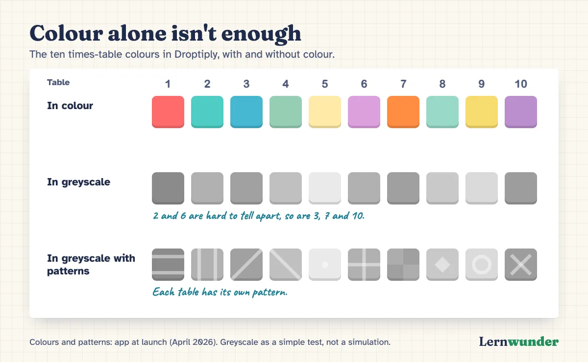
Colour-blind patterns. Each times table in Droptiply has its own colour, set by the smaller number in the fact. With this switch, every square also gets a pattern: horizontal and vertical lines, two diagonals, a dot, a cross, a checkerboard, a diamond, a circle and an X, a different one for each of the ten tables. Importantly, the fact itself is never in the colour; it’s in the numbers and the shape of the block. Droptiply is playable without the patterns too. The patterns help children see which blocks belong to which table.
Dyslexia font. This switch changes the app’s text to OpenDyslexic. We offer it as a choice and say openly that studies show no reading benefit. There isn’t much text in Droptiply anyway. The facts are numbers.
High contrast. Text becomes pure black or white, and surfaces and grid lines stand out more.
Reduced motion. Particles, landing and row-clear effects and the flashes for streaks disappear, and the travelling glow in the neon colour world stands still. Messages such as a level-up appear briefly without a zoom animation. In classic mode the blocks themselves still fall. If you don’t want falling blocks at all, choose Zen mode: there a block only moves when the child moves it.
Sound, music and vibration can each be switched off separately.
Two limits we want to state openly. The four switches have to be turned on in Droptiply itself; they’re off by default. And a short wobble after a wrong answer remains even with reduced motion on. Droptiply is no substitute for a professional assessment of vision, reading or maths.
Frequently asked questions
How can I tell if my child sees colours differently? Repeated mix-ups of particular colours are a sign. Only a test by an eye doctor gives certainty.
Should I set a special font for my child with dyslexia? You can, if they like it. Based on the studies so far, it doesn’t measurably help reading. If anything matters, it’s the spacing between letters and words, not the letter shapes.
Where are the settings in Droptiply? In the settings, under “Accessibility”. Each switch takes effect immediately.
Find out more on the Droptiply page.
Sources
- Dlay, H. K. & Jordan, G. (2025). From a color-blind perspective: Exploring frustration and confidence in schoolchildren with simulated color vision deficiency. Journal of the Optical Society of America A, 42(5), B43. https://doi.org/10.1364/JOSAA.545265
- Fisher, A. V., Godwin, K. E. & Seltman, H. (2014). Visual environment, attention allocation, and learning in young children: When too much of a good thing may be bad. Psychological Science, 25(7), 1362–1370. https://doi.org/10.1177/0956797614533801
- Galliussi, J., Perondi, L., Chia, G., Gerbino, W. & Bernardis, P. (2020). Inter-letter spacing, inter-word spacing, and font with dyslexia-friendly features: Testing text readability in people with and without dyslexia. Annals of Dyslexia, 70(1), 141–152. https://doi.org/10.1007/s11881-020-00194-x
- Jeong, Y. D., Cho, J., Son, Y. et al. (2025). Global prevalence of congenital color vision deficiency among children and adolescents, 1932–2022. Ophthalmology, 132(12), 1431–1444. https://doi.org/10.1016/j.ophtha.2025.07.031
- Kuster, S. M., van Weerdenburg, M., Gompel, M. & Bosman, A. M. T. (2018). Dyslexie font does not benefit reading in children with or without dyslexia. Annals of Dyslexia, 68(1), 25–42. https://doi.org/10.1007/s11881-017-0154-6
- Li, C.-M., Hoffman, H. J., Ward, B. K., Cohen, H. S. & Rine, R. M. (2016). Epidemiology of dizziness and balance problems in children in the United States: A population-based study. The Journal of Pediatrics, 171, 240–247. https://doi.org/10.1016/j.jpeds.2015.12.002
- Marinus, E., Mostard, M., Segers, E., Schubert, T. M., Madelaine, A. & Wheldall, K. (2016). A special font for people with dyslexia: Does it work and, if so, why? Dyslexia, 22(3), 233–244. https://doi.org/10.1002/dys.1527
- W3C (2018). Web Content Accessibility Guidelines (WCAG) 2.1. W3C Recommendation, 5 June 2018 (success criteria 1.4.1 and 2.3.3, with “Understanding WCAG 2.1”). https://www.w3.org/TR/2018/REC-WCAG21-20180605/ · https://www.w3.org/WAI/WCAG21/Understanding/animation-from-interactions.html
- Wery, J. J. & Diliberto, J. A. (2017). The effect of a specialized dyslexia font, OpenDyslexic, on reading rate and accuracy. Annals of Dyslexia, 67(2), 114–127. https://doi.org/10.1007/s11881-016-0127-1
Lernwunder editorial team · Chaolan Lu