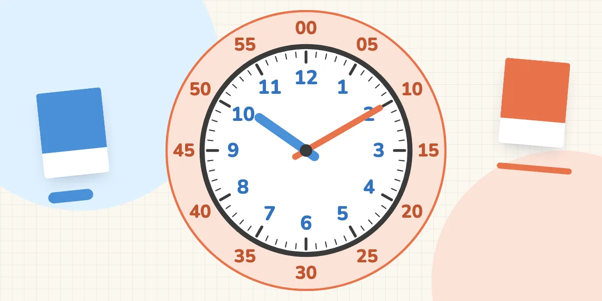
Short answer: Colour can show learners what belongs together. Studies on learning with pictures find a small-to-medium benefit, mainly for beginners. There is no direct evidence for clocks, but there is a good reason: many children start by paying attention to only one hand. Blue and orange stay distinguishable with red-green colour blindness. What matters is that colour is never the only cue and gradually becomes unnecessary, because real clocks rarely have coloured hands.
Look at teaching clocks in any toy shop and you will almost always see coloured hands: red and blue, green and yellow, black and red. The idea is instantly convincing. Two hands, two colours, less confusion. But does it actually help? And which colours are the right ones?
For Tinu Time, our app for learning to tell the time that is currently in development, we have made a decision: hours are blue, minutes are orange, on the hands and on the numbers. In this article we explain what research says, where it is silent, and why we never let colour do the job alone.
Why put colour on a clock at all?
Because children often pay attention to only one hand. In a Flemish study of 725 children, this was the most common type of error in first grade. Misreading the numbers on the clock face was also common (Burny et al., 2012). The 3 means three o’clock when the short hand points to it, and 15 minutes when the long hand does. Why this is so confusing is explained in Why telling the time is so hard.
The idea of colour coding: if the hour hand and the hour numbers share one colour, and the minute hand and the minute numbers another, the colour shows which number belongs to which hand.
What does research say about colour as a learning aid?
Learning researchers call this “signalling”: cues like colour, arrows or highlights direct attention to what matters and show what belongs together. A meta-analysis of 29 studies with 2,726 participants found a learning benefit of d = 0.38 for such signals, a small-to-medium effect (Alpizar et al., 2020).
An eye-tracking study showed how colour works: 52 learners studied an explanation made of text and pictures, either colour-coded or not. With colour coding they remembered more and applied it better, because they found faster which part of the text belonged to which part of the picture (Ozcelik et al., 2009). Matching parts is exactly the task on a clock.
Where does colour reach its limits?
We take three limitations seriously.
First: there is no study on clocks. The studies above come mostly from other subjects and often involve older learners. We have not found a study that compares coloured and plain clock hands when children learn to tell the time. Our decision is reasoned, not proven.
Second: colour mainly helps beginners. In a field study with eighth-graders, students with little prior knowledge learnt better with extra signals such as colour coding. For students with a lot of prior knowledge, the same signals were actually harmful (Richter et al., 2018). For the clock, this means colour is a help for getting started, not a permanent solution.
Third: learning with colour may create a need for colour. A study with adults found the worst results among those who learnt with colour coding and were then tested without it (Skulmowski, 2022). The kitchen clock does not have blue and orange hands. If you start with colour, plan for it to disappear at some point.
Why blue and orange, not red and green?
Because red and green are hard to tell apart for many children. Inherited red-green colour deficiency affects about 8 per cent of men of European descent and about 0.4 per cent of women (Birch, 2012). Statistically, many classes will have at least one boy who easily confuses red and green.
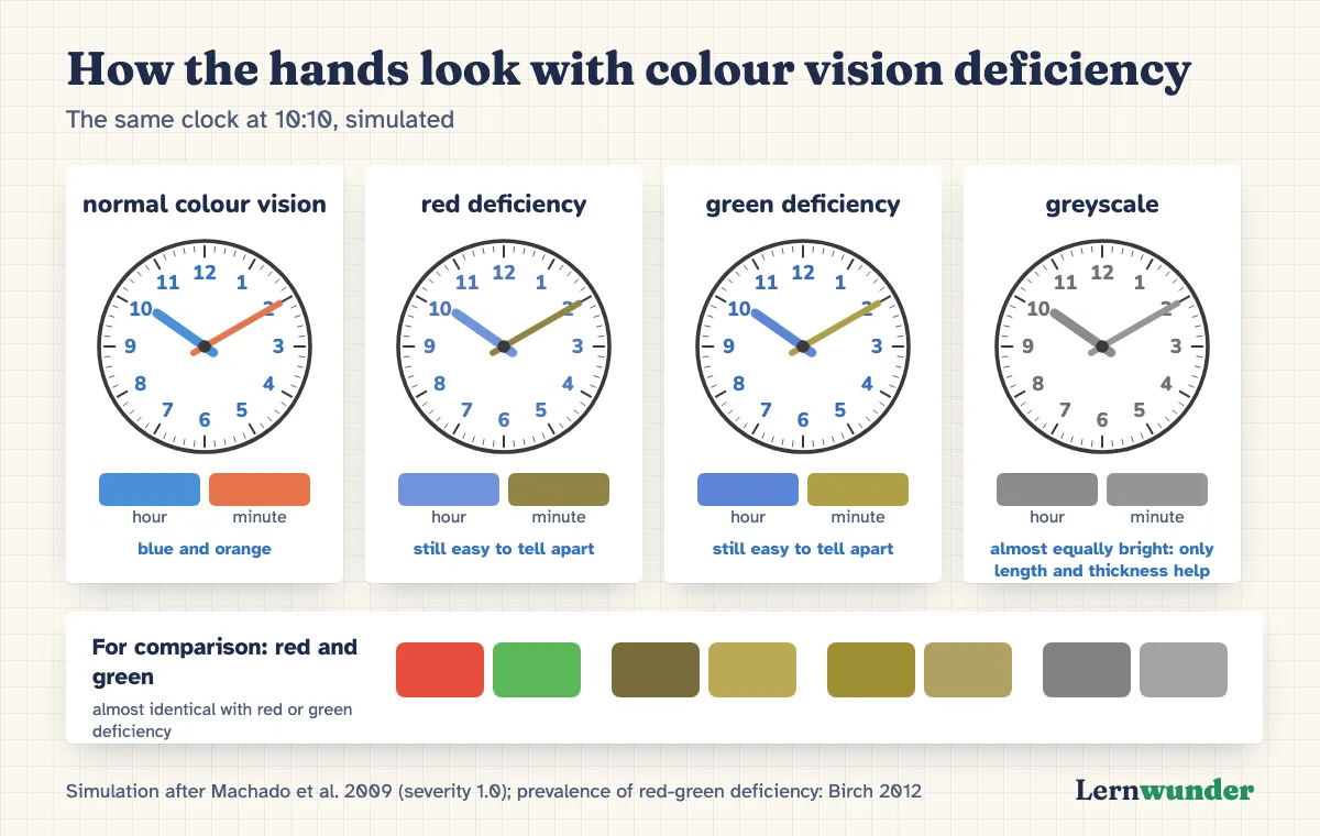
Okabe and Ito (2008) recommend alternating warm and cool colours in graphics meant for everyone, and darker blue and orange for thin lines. We checked our two hand colours with an established model for simulating colour vision deficiency (Machado et al., 2009). With red or green deficiency, the hour hand stays blue and the minute hand turns a yellowish olive. The two remain easy to tell apart.
One result surprised us: blue and orange are almost equally bright. In greyscale, for example on a black-and-white printout, the two hands can hardly be told apart by colour. That is one more reason why colour must never be the only cue.
What else distinguishes the hands?
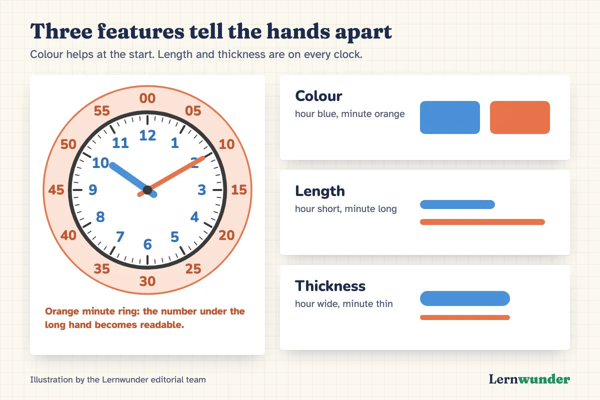
On every good clock: length and thickness. The hour hand is short and wide, the minute hand long and thin. You find these differences on every kitchen clock, station clock and watch. Colour is an extra bridge towards them, not a replacement.
There is a third cue you can add yourself: a ring with the minutes 00, 05, 10 up to 55 around the edge. In the same colour as the minute hand, it shows what the number under the long hand means.
What you can do
- Two colours, always the same. If you buy a teaching clock or make your own, use one colour for hours and one for minutes and stick to it: on the clock, on worksheets, when drawing.
- No red-green pair. Choose colours that also differ in brightness, such as dark blue and light orange.
- Name length and thickness, too. Don’t just say “the blue hand”, say “the short, thick hour hand”.
- Fade the colour out. Once your child is confident, keep practising with a plain clock, for example the one in the kitchen.
- Ask if in doubt. If your child often confuses certain colours, talk to your paediatrician. A colour vision test is quick.
What we are working on
In Tinu Time, hours are meant to be blue and minutes orange throughout: the hour hand and hour numbers in blue, the minute hand and minute ring in orange, as announced in Analogue before digital. Colour is not the only cue: our hour hand is clearly shorter and wider than the minute hand.
Where research made us think: we are planning unlockable clock designs as a small reward, with hands in other colours, which open only after a child has completed a step. Given the findings on fading, this may even help, because children then have to read length and thickness. It may also confuse, if a colour suddenly means the other hand. So the classic blue and orange will always remain available. We want to see how children cope with the designs before we say more. Tinu Time is not finished yet.
Frequently asked questions
Is a colour-coded teaching clock better than a plain one? There is a lot to be said for it at the start, but no direct evidence for clocks. It is important to practise with plain clocks later, too (Skulmowski, 2022).
My child is colour blind. Can colour-coded hands still help? With blue and orange usually yes, with red and green less so. Length and thickness of the hands help in any case.
Which colour should the hour be? That matters less than consistency. What counts is that a colour always means the same thing.
Sources
- Alpizar, D., Adesope, O. O. & Wong, R. M. (2020). A meta-analysis of signaling principle in multimedia learning environments. Educational Technology Research and Development, 68(5), 2095–2119. https://doi.org/10.1007/s11423-020-09748-7
- Birch, J. (2012). Worldwide prevalence of red-green color deficiency. Journal of the Optical Society of America A, 29(3), 313–320. https://doi.org/10.1364/JOSAA.29.000313
- Burny, E., Valcke, M. & Desoete, A. (2012). Clock reading: An underestimated topic in children with mathematics difficulties. Journal of Learning Disabilities, 45(4), 351–360. https://doi.org/10.1177/0022219411407773
- Machado, G. M., Oliveira, M. M. & Fernandes, L. A. F. (2009). A physiologically-based model for simulation of color vision deficiency. IEEE Transactions on Visualization and Computer Graphics, 15(6), 1291–1298. https://doi.org/10.1109/TVCG.2009.113
- Okabe, M. & Ito, K. (2008). Color Universal Design (CUD): How to make figures and presentations that are friendly to colorblind people. https://jfly.uni-koeln.de/color/
- Ozcelik, E., Karakus, T., Kursun, E. & Cagiltay, K. (2009). An eye-tracking study of how color coding affects multimedia learning. Computers & Education, 53(2), 445–453. https://doi.org/10.1016/j.compedu.2009.03.002
- Richter, J., Scheiter, K. & Eitel, A. (2018). Signaling text–picture relations in multimedia learning: The influence of prior knowledge. Journal of Educational Psychology, 110(4), 544–560. https://doi.org/10.1037/edu0000220
- Skulmowski, A. (2022). When color coding backfires: A guidance reversal effect when learning with realistic visualizations. Education and Information Technologies, 27(4), 4621–4636. https://doi.org/10.1007/s10639-021-10796-6
Lernwunder editorial team · Chaolan Lu